

Color Study No. 2
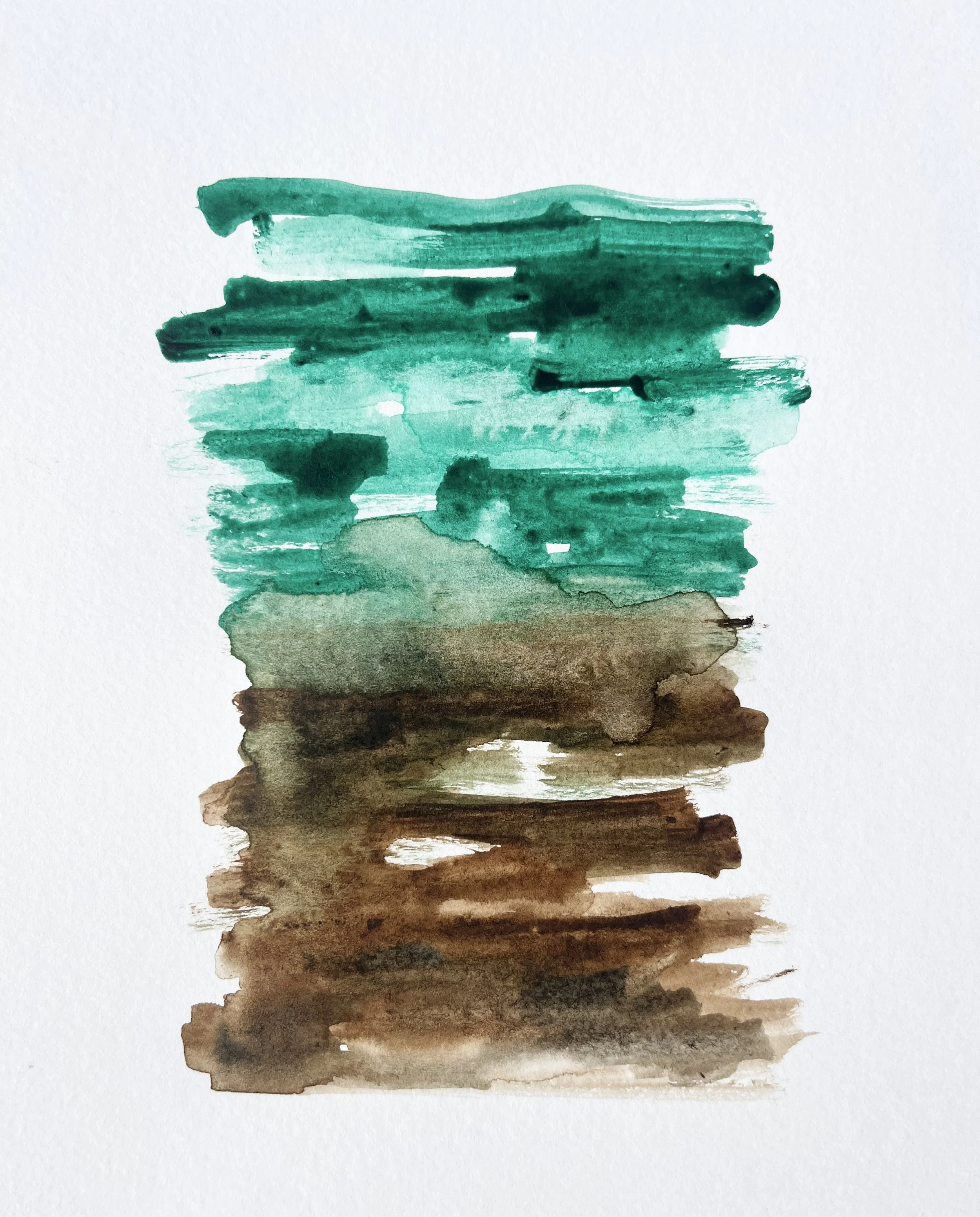
Watercolor Artistry by Shannon Blanton of Studio Shannon Blanton
A Spring-Inspired Color Palette
May is the quiet turning point in the garden—the moment when brown earth softens and releases its grip, and green begins to gather momentum. This palette is a study in transition, where the memory of dormancy still lingers just beneath the surface of emerging life.
Warm tones begin to rise gently rather than announce themselves. Variegated green euonymus catches the light in uneven flashes, while bronzed maple holds onto the last echoes of early spring’s restraint. Hellebores remain grounded and steady, their muted elegance bridging the gap between seasons.
Tucked into this unfolding green are deeply veined epimediums—delicate yet architectural, offering texture that feels both ancient and new. Light enters the composition through creamy white and apricot narcissus, their warmth acting as a quiet signal of change, of momentum building. Leucojum nods softly in the breeze, almost imperceptible, as if acknowledging the garden’s slow agreement to awaken.
This is not a palette of contrast, but of transition—where edges blur and color does not yet settle into certainty. Instead, it moves, stretches, and gently insists on becoming.
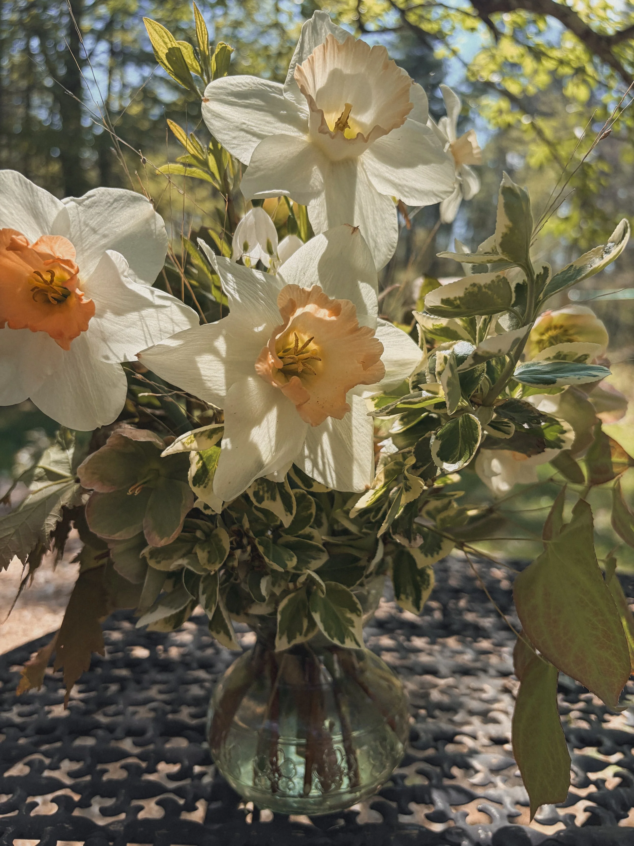
A Posy featuring garden blooms